
Multicolor Printing on Dark Garments 2020-08-10 05:36:31
Multicolor Printing on Dark Garments
By: Charlie Taublieb
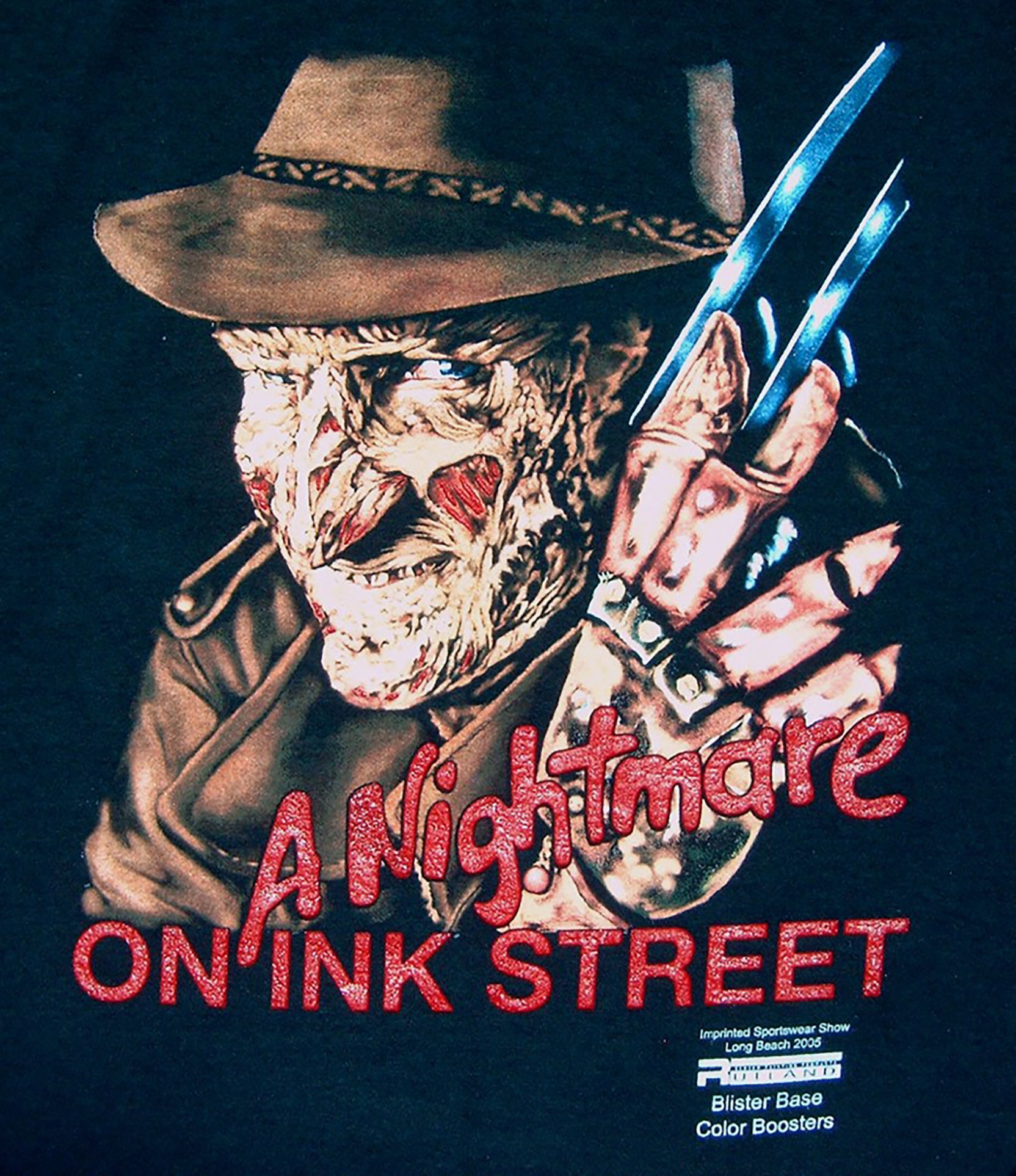
When I hear the term “Simulated Process Printing”, I immediately think of black shirts. Maybe it’s because of my background in this industry of printing Rock’N’Roll shirts when I first started. That’s not to say that simulated process printing can’t be done well on other colored garments, and in fact, if designed and separated properly, the printing will look good on every color from black to white, but is usually associated with dark colors.
“Simulated Process Printing” is a term that is often used but not always defined. My interpretation of the term is “appears to be full process printing-an image is made that is made using half-tones of yellow, magenta, cyan and black-to create a full color effect, but is not.” The image appears to have full color, but in fact is made of the specific colors needed for that image. The colors may change from image to image and the inks are usually opaque. The image, if designed and separated properly, can be printed on any color including black.
In order to make your simulated process print you need a lot of contrast, that means strong highlights and strong shadows with a single directional light.
In order to have a successful print, it is important to understand what it will take to make a good simulated process print or, in my case, a good black shirt print.
1-Know who you are designing for. When I first got into this industry, we printed for Rock’N’Roll concerts. Today, but especially at that time-1970’s, anything other than a black shirt wouldn’t sell very well at a concert. If you are designing for bikers, X-treme spots or some of the pro athletes, black is the color that is most asked for. Besides, bikers just don’t wear pink!
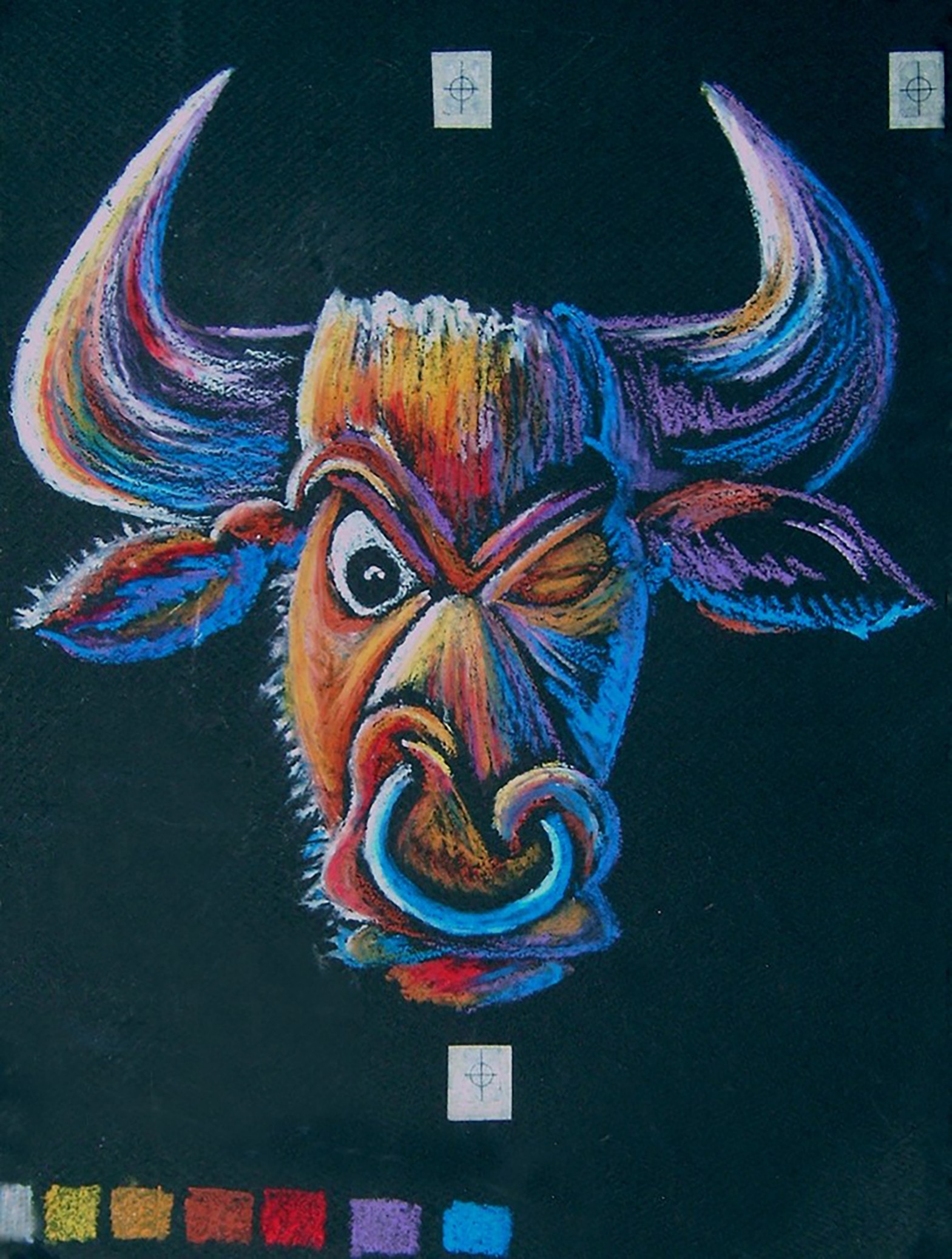
2-Size is important. The reason people wear black shirts is because the colors stand out. To make this even more effective, design with large, easily identifiable images and bright colors. In designing concert shirts, we would simulate the conditions to see if the shirt would stand out. We would illustrate our design using Craypas-oil based pastels-on illustration boards, put them on the wall, and view them from about fifteen feet away with the lights darkened. If we were able to identify the images quickly, then we knew we had a sellable shirt. If not, we would re-work it until it was very visible.
When designing for retail, it is important for the design to catch your eye as soon as you walk in the proximity of it. If it doesn’t catch the eye, no one will go to it and it can’t sell. Design as large as possible.
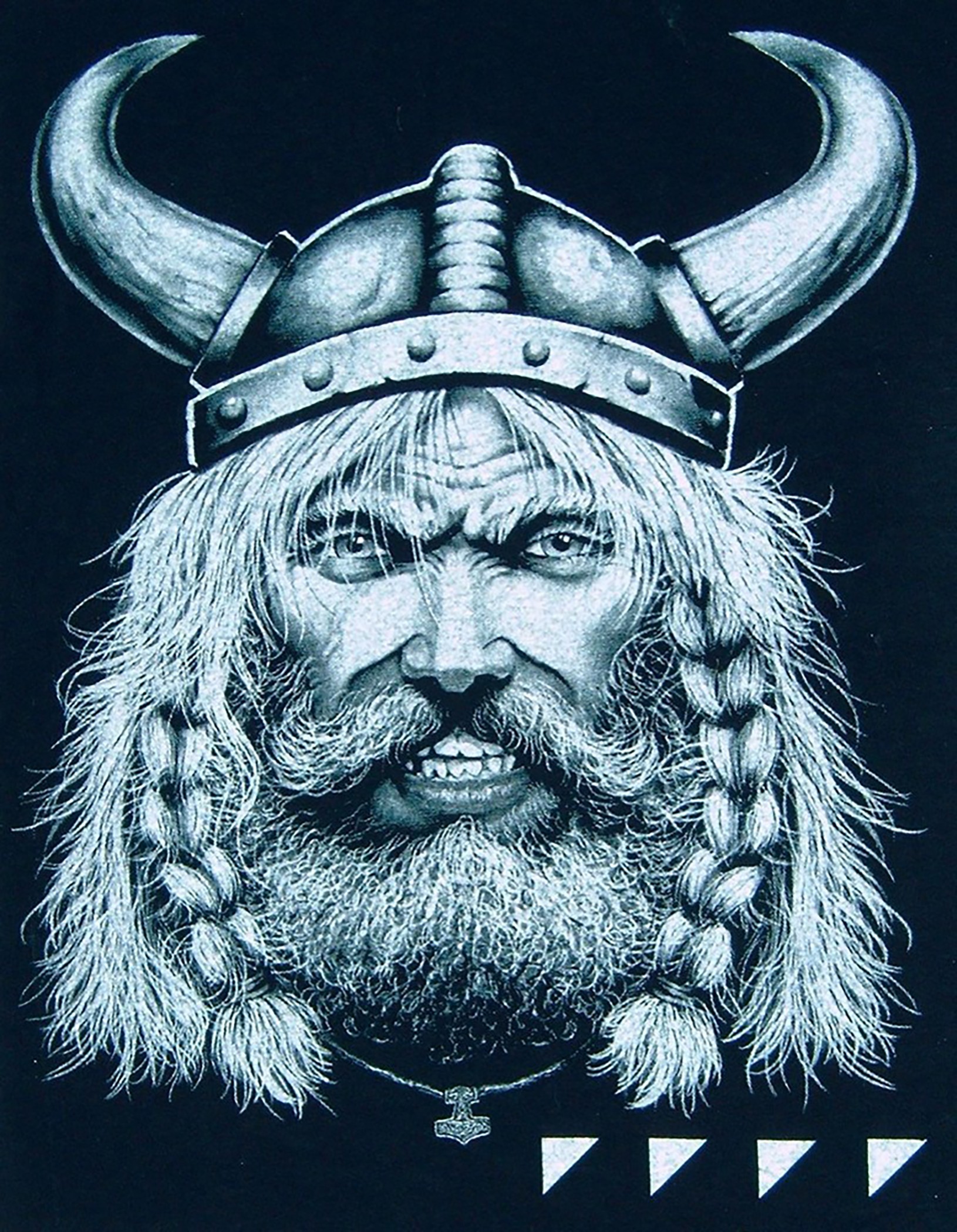
3-Color of background. In previously mentioning illustration board for illustrating a design, I was referring to black illustration board. One of the tricks to having a successful design on black shirts, is to design on black. The reason for this is you don’t print black on a black shirt. By using black illustration board , you only illustrate the highlights and mid-tones, the shadows are already there-the black shirt itself provides the shadow. If you design on a light background, you will need to illustrate the highlights, mid-tones and shadows, which is what is needed for a light or white shirt and will have to print a solid underlay to print on black, because you didn’t design for black. What you’ll end up with is the equivalent of a heat transfer that has been directly printed to the garment. It will be missing the strong look and will require a black printer even on a black shirt. The best way to do this today is to change you monitor from a white background to a black one and then start working.
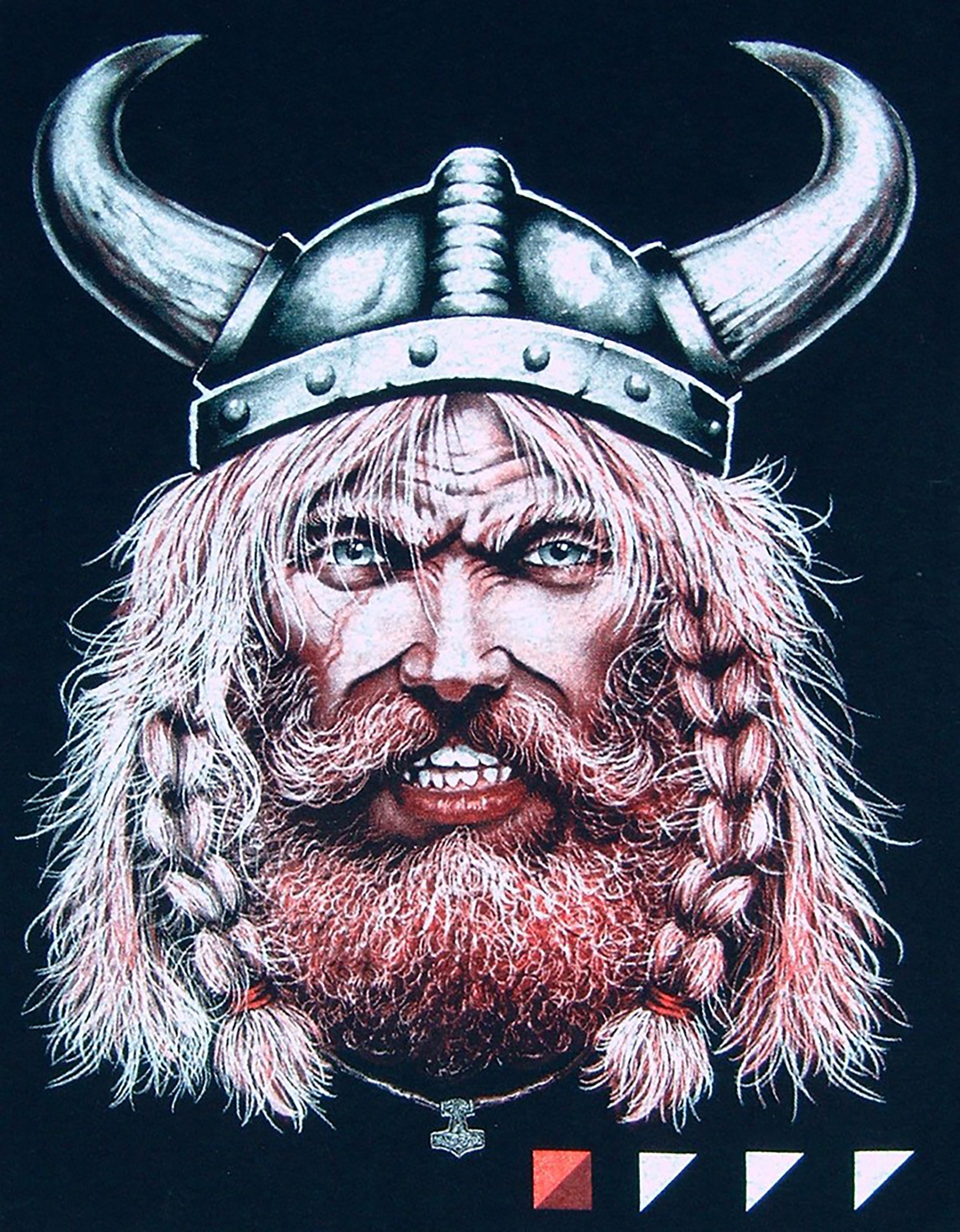
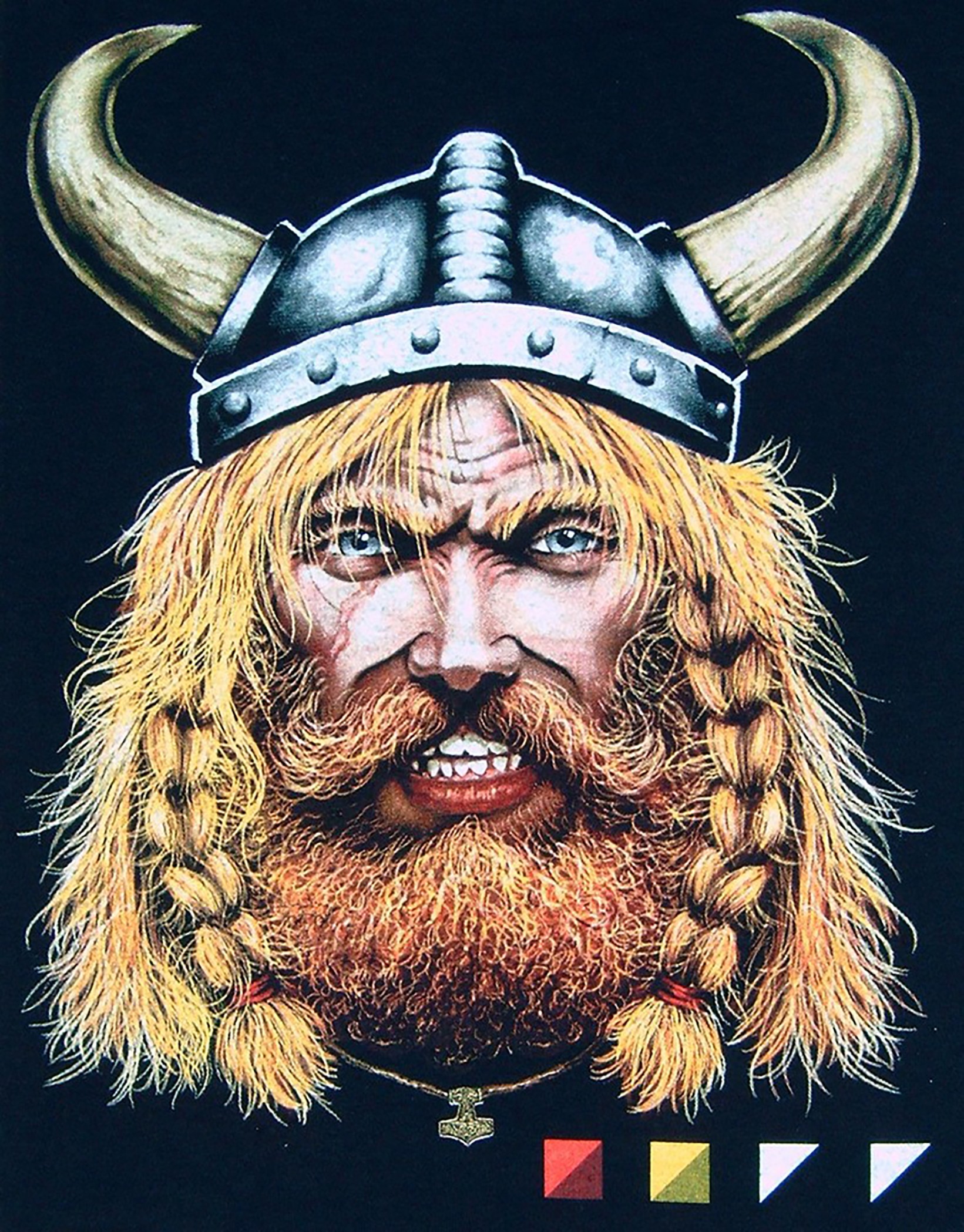
4-Bright colors. The reason many people wear black shirts is to stand out. In order to do that, you need to use bright colors. Lots of reds, yellows, blues, greens and purples, among others. As long as they stand out, the shirt will have a chance at success.
When designing artwork by hand for black shirts, use black illustration board so you can get a feel for how the print will look.
5-Contrast of the design. This is probably the most overlooked area and probably the most important. Why? Because black shirts are made to stand out. In order to stand out, we need a lot of contrast-strong highlights and black shadows. Keep in mind that we are not necessarily looking for an anatomically correct image; we are looking for a design that will sell on a t-shirt. The fact that it isn’t anatomically correct means nothing to us. How much contrast is necessary? Very bright highlights and black shadows. How do we achieve this? By assigning a single point light source to shine on out image. The light can come from anywhere except straight forward. Straight forward flattens a design.
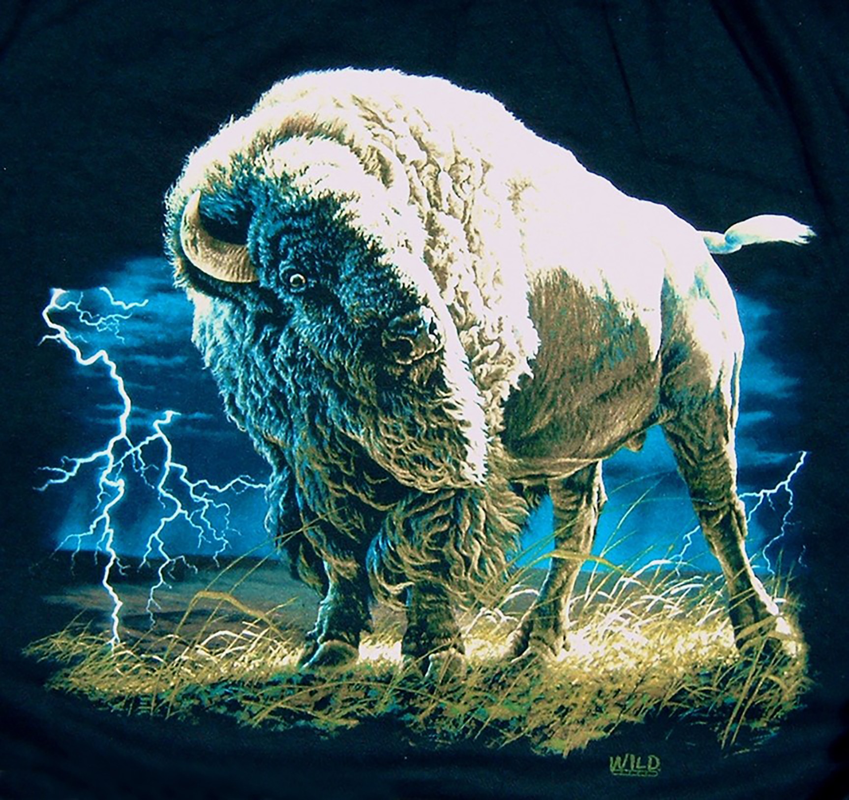
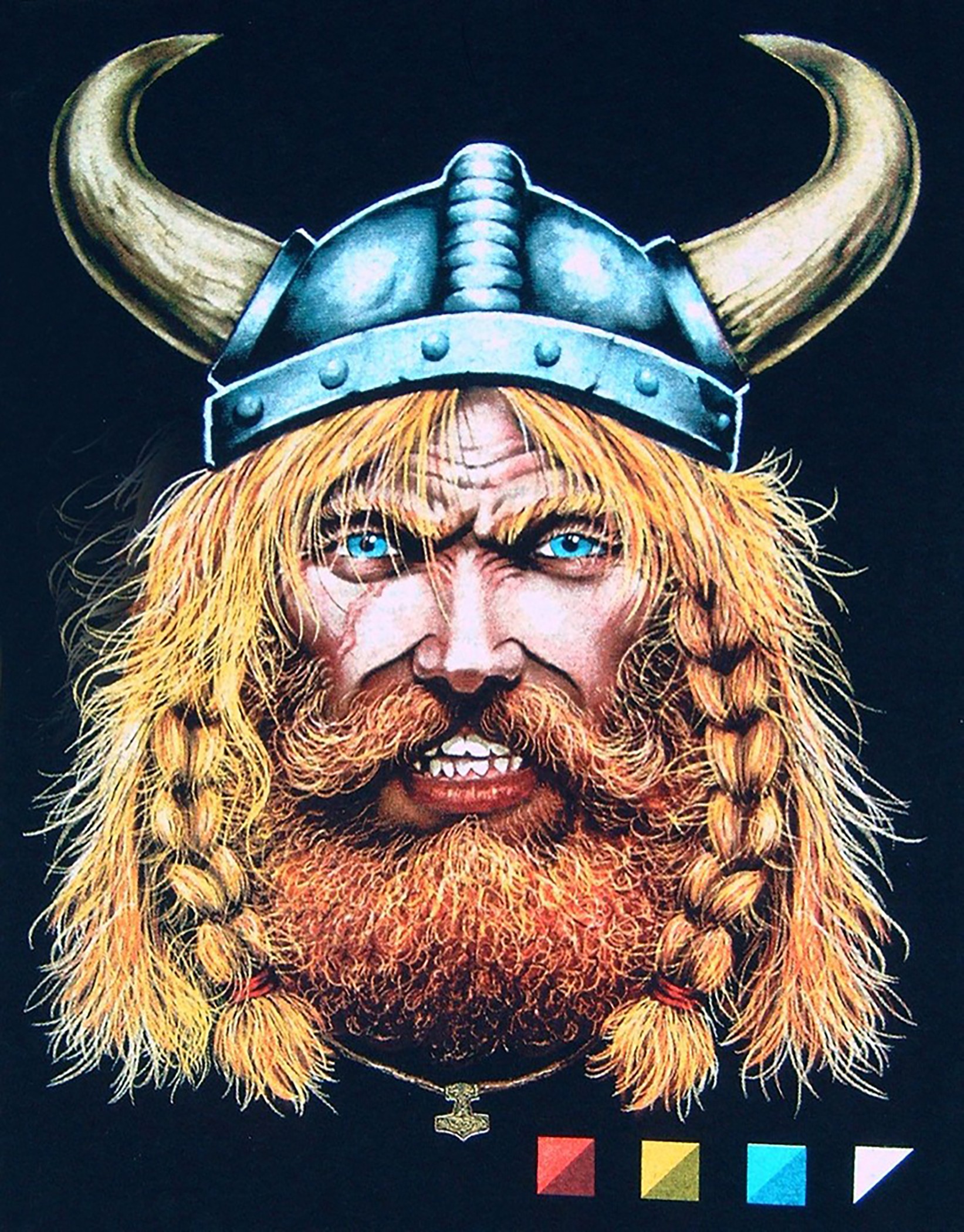
This is the finished print that was started as hand drawn artwork.
6-Separations. Once the design is done, it is ready to be separated. Back when I first started out, we did all of our separations using a combination of hand and camera work. Between designing and separating, it was not unusual to have thirty to forty hours into a design. Today, with the software available, knowing how to do it by hand is not as important. There are a number of Photoshop plus-in programs available and even a stand alone program that doesn’t need Photoshop to run. It only needs a raster based program to work with. The separation process may only take a very short time, based on the design and experience of the operator, or may take hours, but a lot less than what we had to do. Many of the programs are available on line for a free trial. Try several of them out prior to purchasing to make sure you like the results. Remember one thing, bad art, even when separated well, will still be bad art!
7-Resolution, LPI, dot shape and angle. In choosing my resolution, I like to be two to two and a half times what my LPI will be, or somewhere between one hundred and one hundred and fifty since I like to work with a forty five to fifty five LPI. I use a sixty one degree angle for all separations and an elliptical dot.
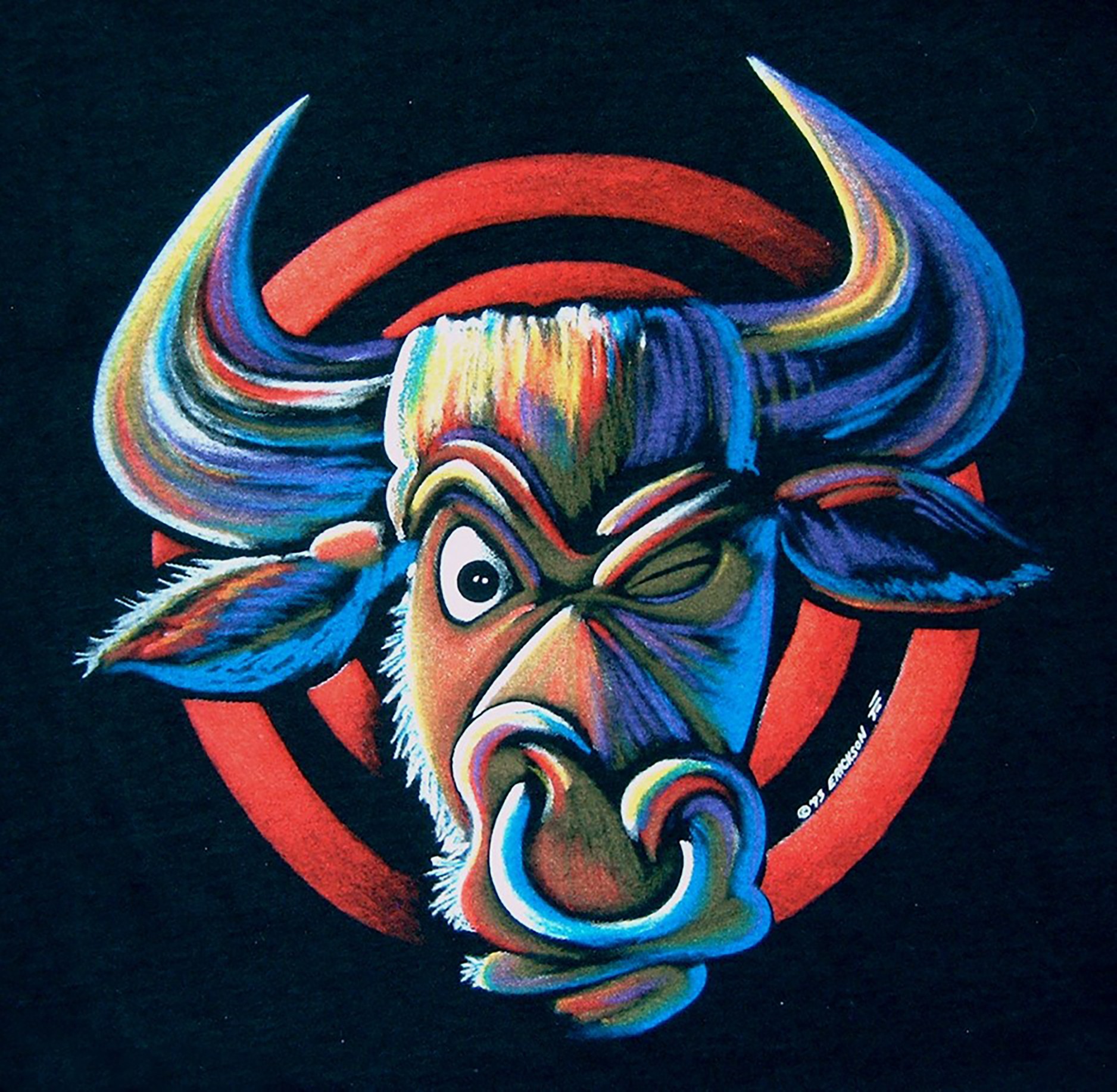
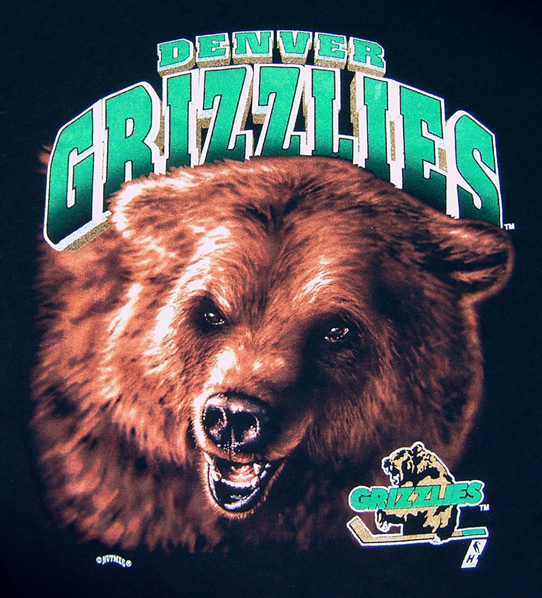
Designing for black shirts allows you to print on any color just by adding the black printer.
8-Mash counts. Based on the mentioned LPI, I like to use the following mesh counts;
110 (43 cm) @ 35 N/cm for my underlay on fleece. It sometimes moirés in the highlight areas, but that is usually covered by the colors going down on top of the underlay.
156 (61 cm) @ 35 N/cm for my underlay on t-shirts.
230 (90 cm) @ 35n N/cm for all of my other colors including my highlight white.
I only flash my white underlay. After the underlay, all colors are printed wet on wet. I rely on my colors blending together to give me a three dimensional effect.
9-Squeegees. When printing on a manual press, I like to use a 70 durometer, sharp straight squeegee. It is important to be sharp and straight so you don’t eliminate the reason for using a high tension screen. It is important to print with as little pressure as possible so the ink sits on top of the shirt. If any ink shows on the inside of the shirt or the pallet, then too much pressure is being used. For an automatic, I like the 65/90/65 triple durometer squeegees at a twenty five-thirty degree angle with minimal pressure.
10-Ink. I always use an opaque plastisol and try to avoid using florescent colors. Florescent colors are very sticky and will build up and clog your screens forcing you to stop and wipe them. When you do this, it will take approximately eight shirts to get the proper build-up of ink on the bottom of screens so the print matches the rest of the production run.
When starting a job, after registration of the screens is complete, strike off a shirt with four to six print strokes. The set up shirt will look very weak with its colors, the next shirt will look very strong with it’s colors and the shirt that follows will be your production run shirt. The colors shouldn’t change throughout the run unless a screen is wiped.
Good Luck!
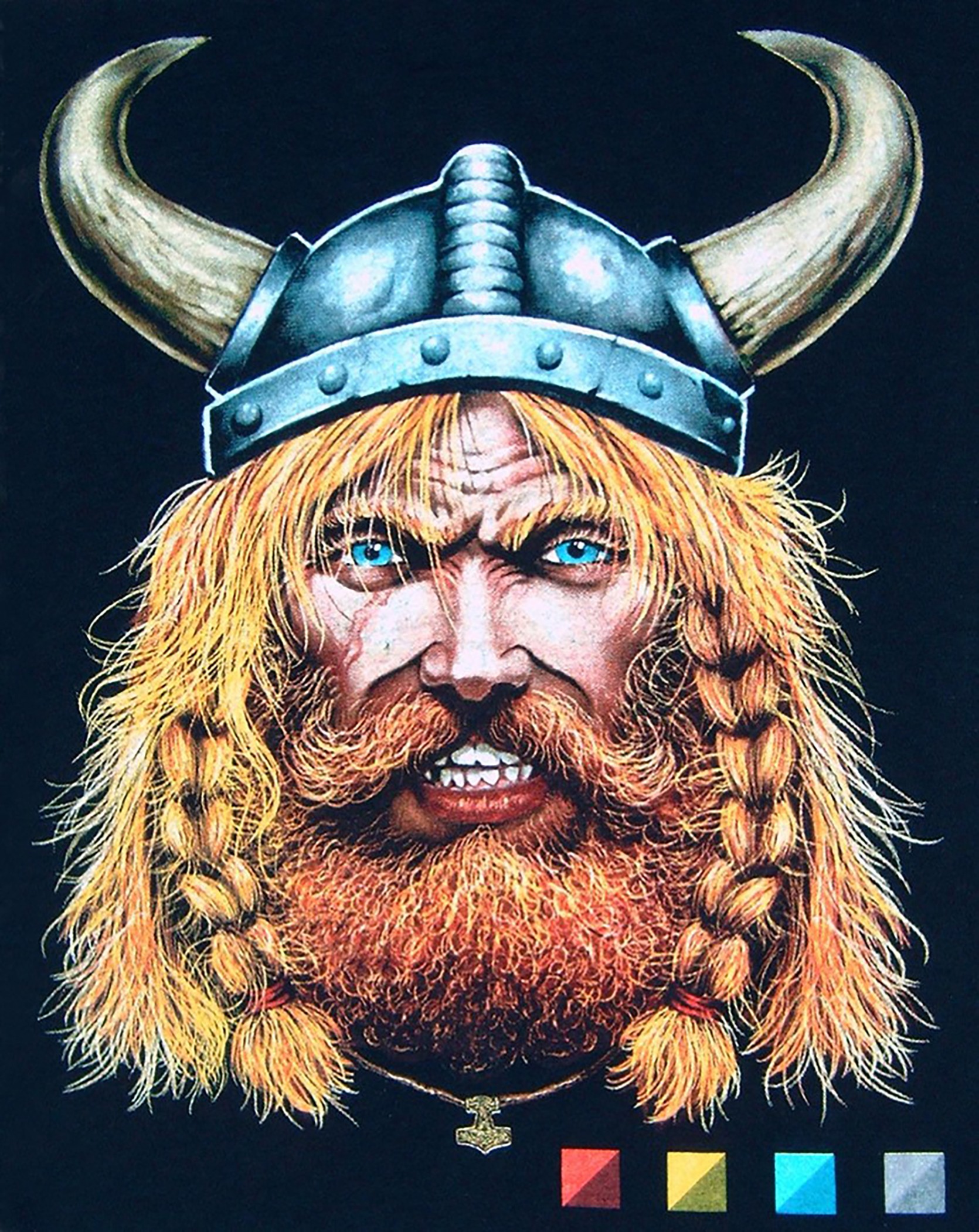
Underlay, flash. This is the only color that gets flashed. All other colors are printed wet on wet to get the desired effect. All inks are opaque.
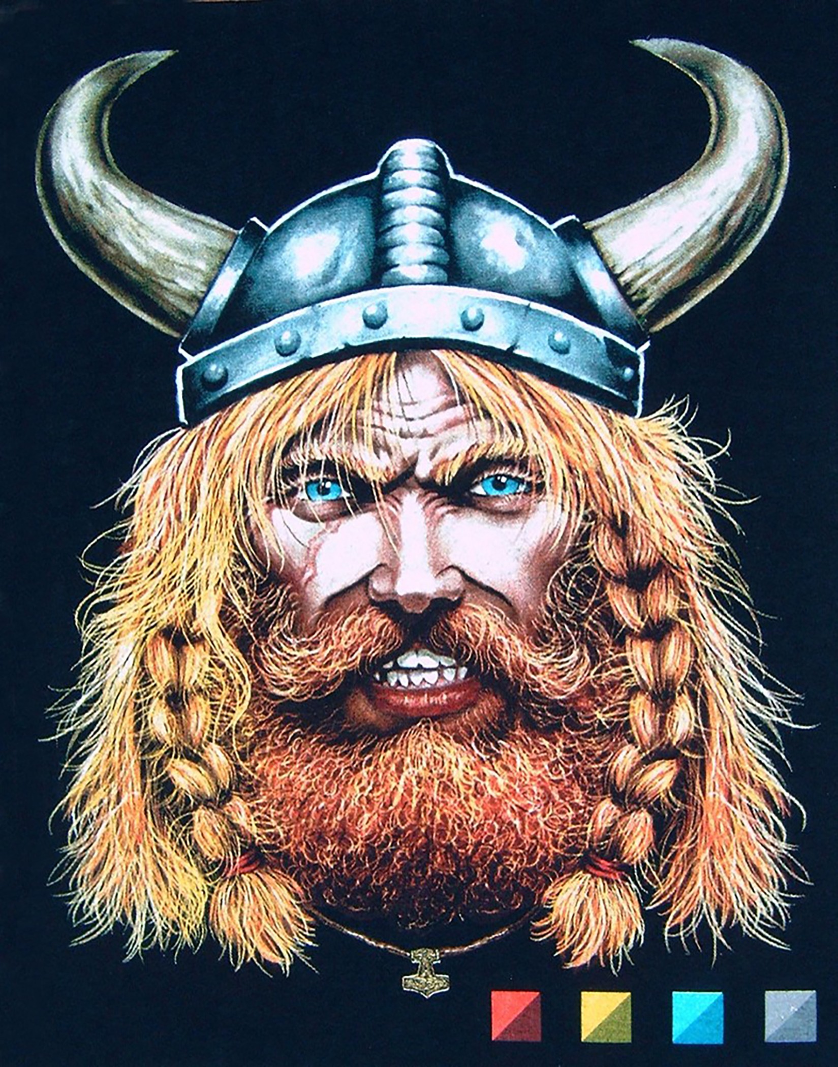
Highlight White. Finished print.
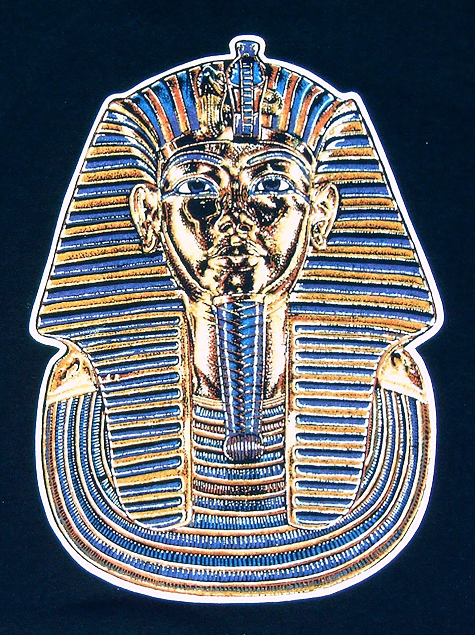
Artwork designed and separated by Dane Clement of Great Dane Graphics. www.GreatDaneGraphics.com
Taublieb Consulting
6122 South Boston Circle
Greenwood Village, Colorado 80111
Tel. 1(303) 290-8009
Cell 1(303) 618-8955
Fax 1(303) 779-0750
Skype drprint2001
www.taubliebconsulting.com
drprint@aol.com
Member: Academy of Screen Printing Technology